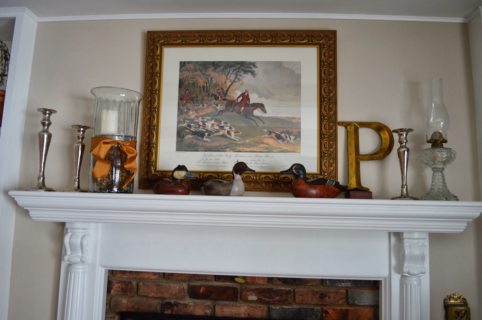
I usually change the mantel up seasonally...so moving from autumn to Christmas is usually fun and not too hard to do, with so much to use for decorating... I get stumped in the period right after Christmas...it's too soon to really do Easter or springtime motifs... so I like to do an "everyday" sort of look... A look that plays off the colors in the room and the overall look of the room. For me the goal is to have the mantel be a focal point, but not stand out too much, I like the room to blend...effortlessly...or at least that is the goal!
I started with a blank canvas; a plain mantle. If you have not seen the before and after of the fireplace blog entry... it's worth a visit, just to see the change. Fireplace Makeover
The rug (first photo) in the family room is from Ballard Designs (The Catherine, 2013), I am planning to use the subtle greys, tans and honey colors that are in the rug for the mantle...I hope it will work with the wall color...
Artwork is usually the first accessory. It needs to be something you like to look at first... and the right size. Whatever artwork you choose, it should fill the space nicely, but not be too large and overwhelm the space. The biggest key with artwork over a mantel is not too tiny and not too large... "just right" in the words of Goldilocks... Even doing a pair of medium sized pieced would work, or layering them one slightly in front of the other could also work. Obviously, everyone who has a fireplace mantel will be dealing with varied sizes of wall space, ceiling heights... choose the best fit for your home. Once your artwork is up, be sure not to block it with tall items, taller items will go to the sides so the artwork can be seen. Smaller items can be layered in front of the artwork.
Decorating works best is odd numbers... so try to work in grouping of three or five.
Here, I added candle sticks for height and a tall oil lamp on each side. These flank the artwork, farming it and not getting in the way of seeing the art either. Three items on each side...similar in color, a little silver and glass to add shine--on both sides
About TVs above the mantle... I know lots of folks put the TV above the fireplace... I considered it too... I don't love it there for two reasons... I don't normally look that high to watch TV, so it doesn't work for me in that respect. Secondly, I think it is really hard to make a TV look stylish in general...on the mantle it's out there, there is no hiding it. If it's on, it's colorful, loud and busy as the focal point or if it's off, it becomes a large dark box...both of which are hard to get right in the décor department... So for those reasons I kept our TV out of sight in a piece of furniture. It's a really tough decorating dilemma...
I added a little texture and something from nature by adding the dried berries in the honey-brown colored crock. I added the candles too.
All the these items were already in my home. Try to shop in your home first, you may be surprised by the items that you can pull together and give them a new life on the mantel. I did mix silver and gold tones, (artwork frame, letter "P" & candlesticks) I think it works in this instance, but too much of either can be too flashy on a mantle...unless of course it's Christmas...then all bets are off!


No comments:
Post a Comment